Relex Solutions
A flexible multi-language site for a leading technology company
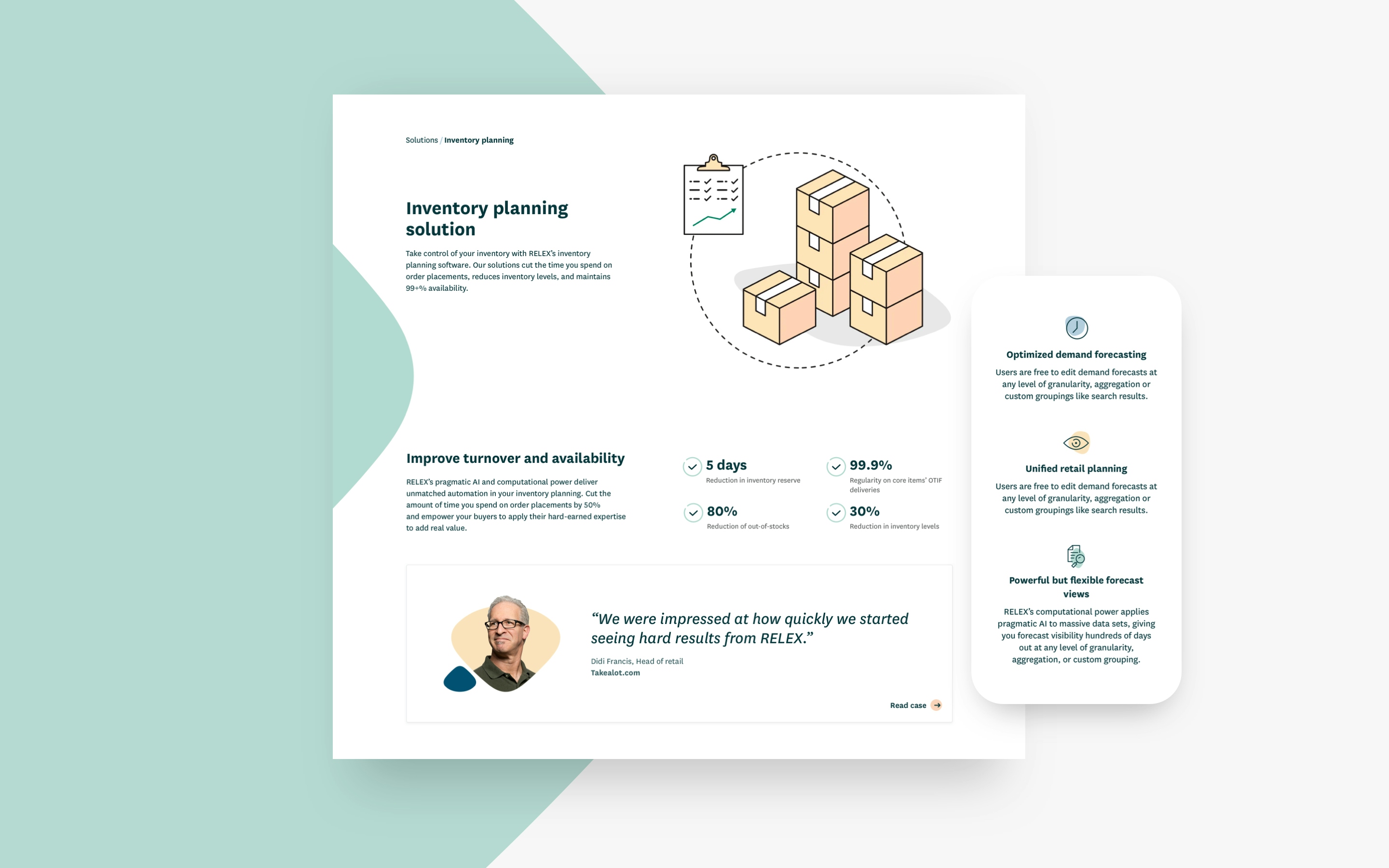
Comprehensive brand audit, website redesign and future-proof technical development for Relex Solutions, one of the world’s leading providers of retail optimization software
www.relexsolutions.com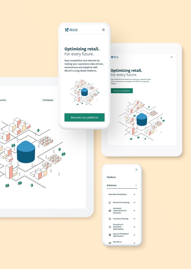
About the client
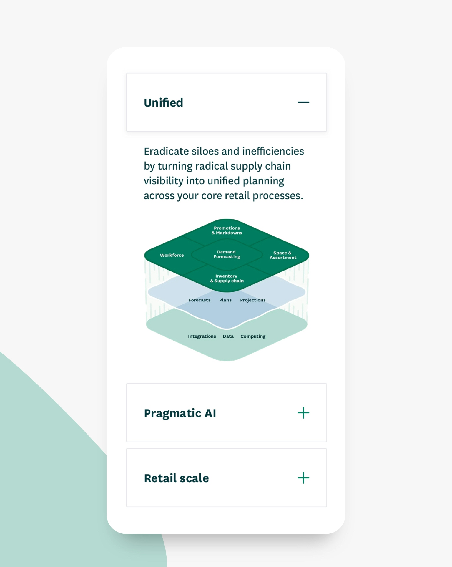
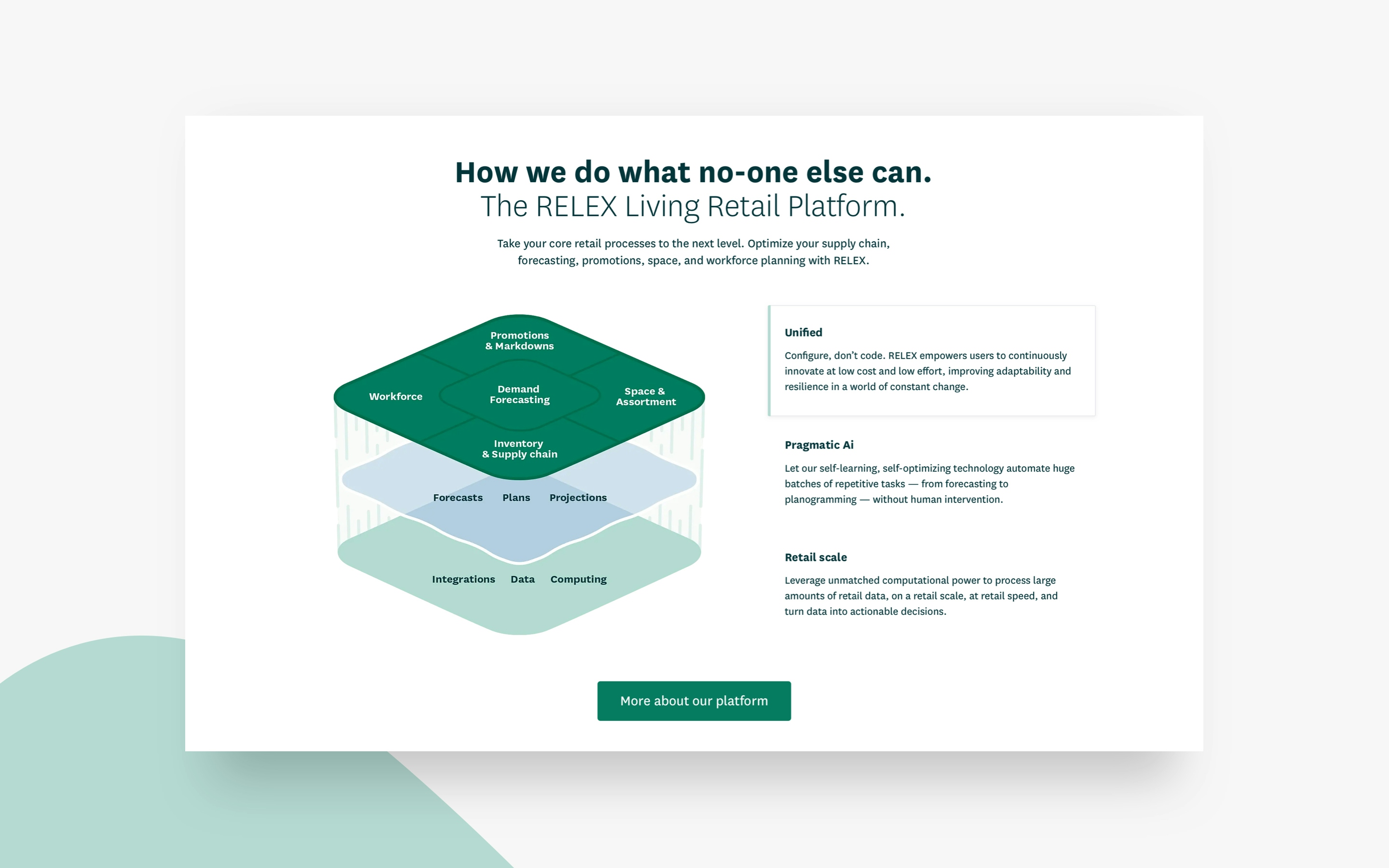
Founded in 2005, RELEX is a software company that provides cutting-edge products to the world’s leading retailers. Their highly adaptive Living Retail platform optimizes retail processes with a granular level of accuracy, which helps their customers achieve exponential benefits. RELEX chose Contrast to be their partner for extending their exceptional level of quality and dedication to their digital presence.
Challenge
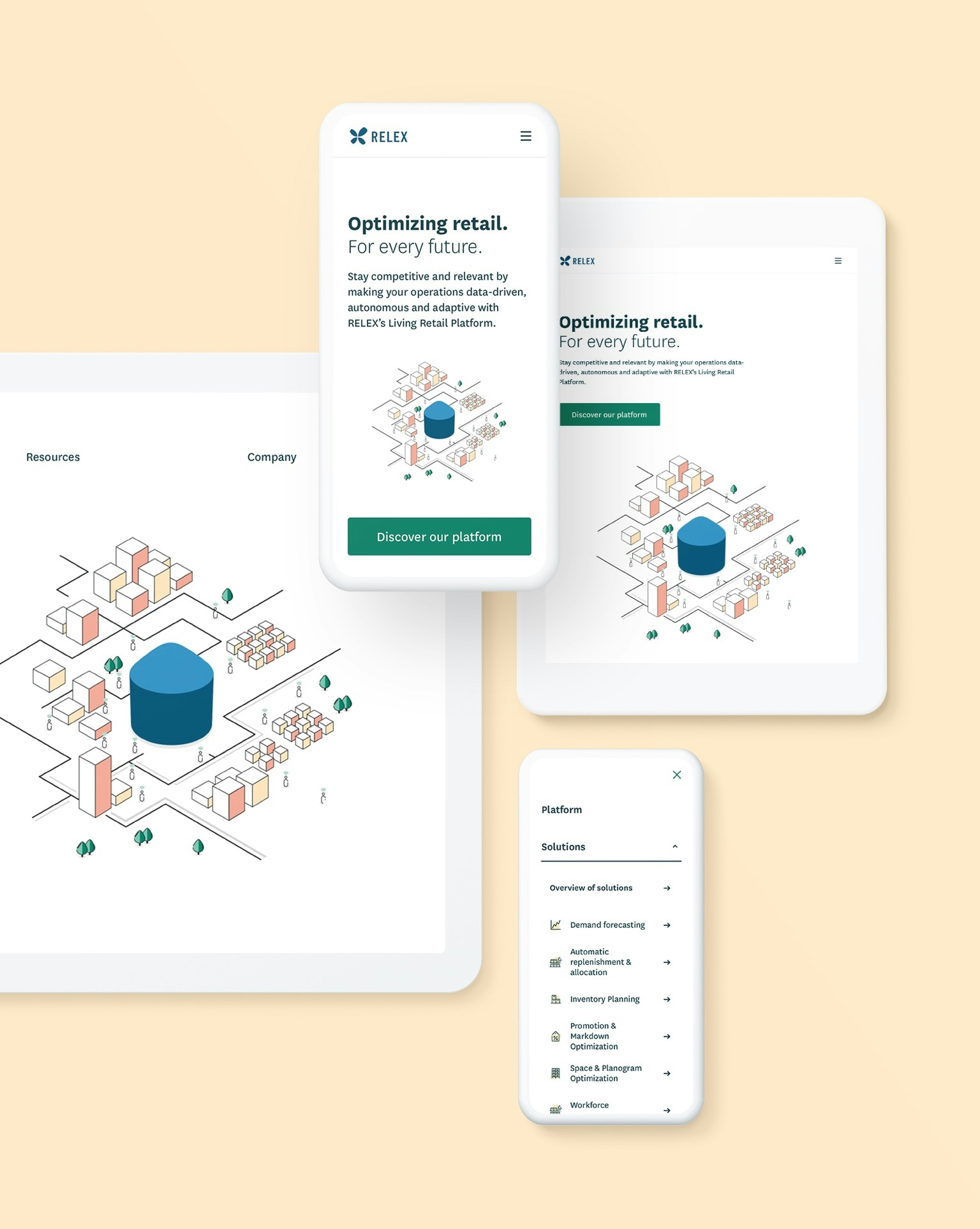
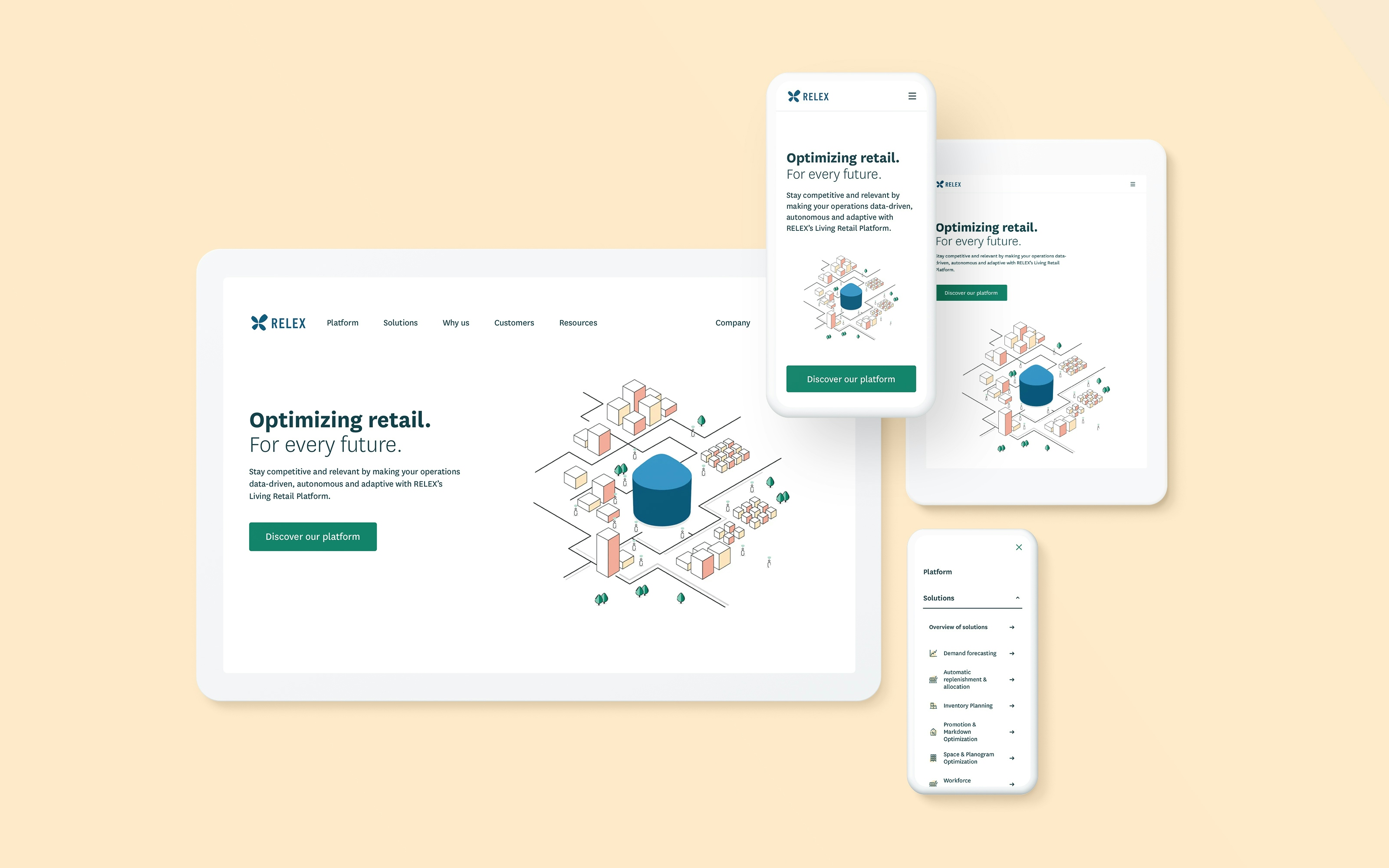
When RELEX approached Contrast, their team was in the process of refining their core story and wanted to update their brand visuals and massive multi-language website to match. Aside from a visual face-lift, their existing website needed a full technical overhaul, as years of manual fixes had made it inflexible, slow and clunky to work with. On top of that, everything needed to be launched within 4 weeks, just in time for a big trade-show reveal. A challenge even for an experienced agency.

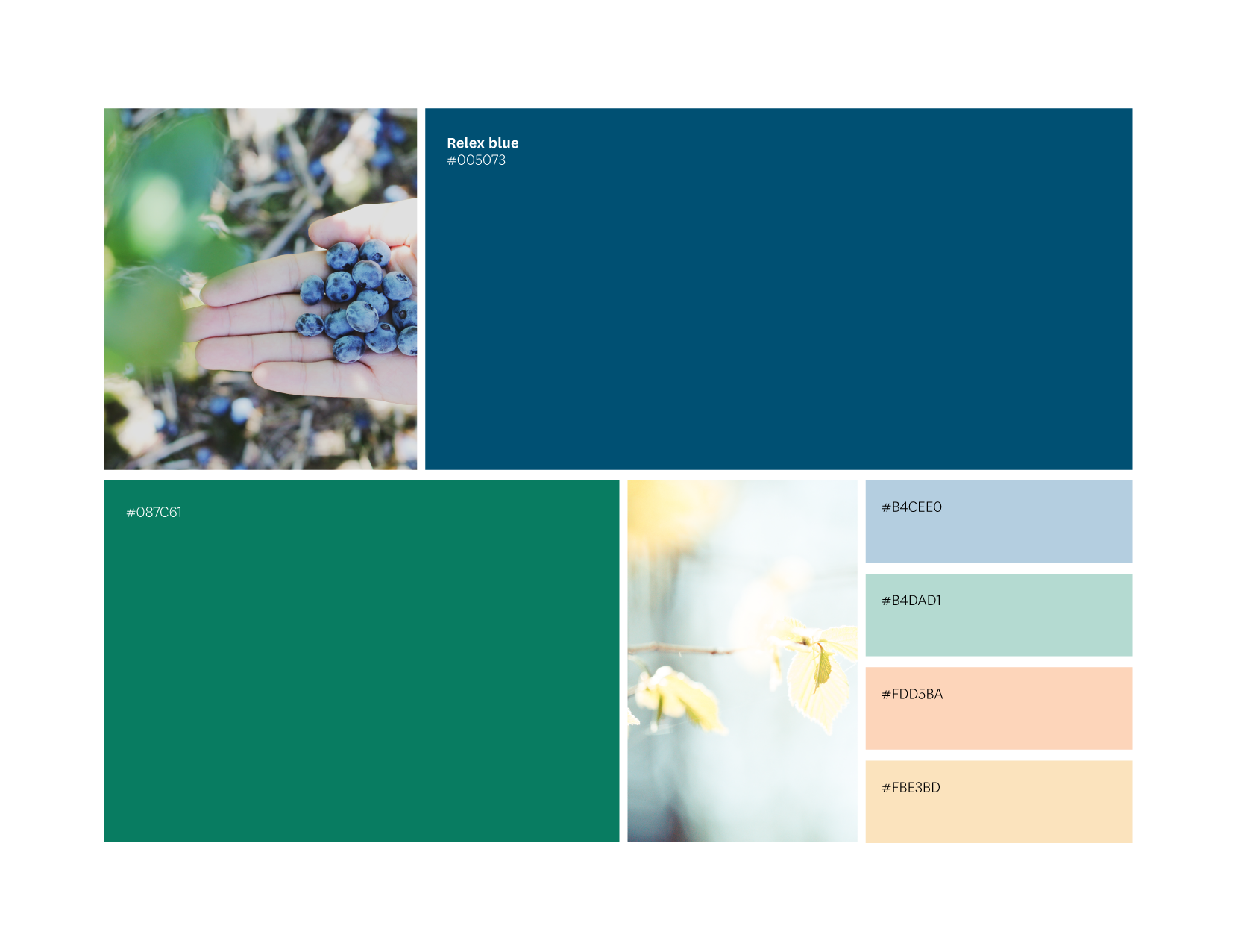
A unique color palette
We created a harmonious and unique color palette that strengthens the humanity of the company.
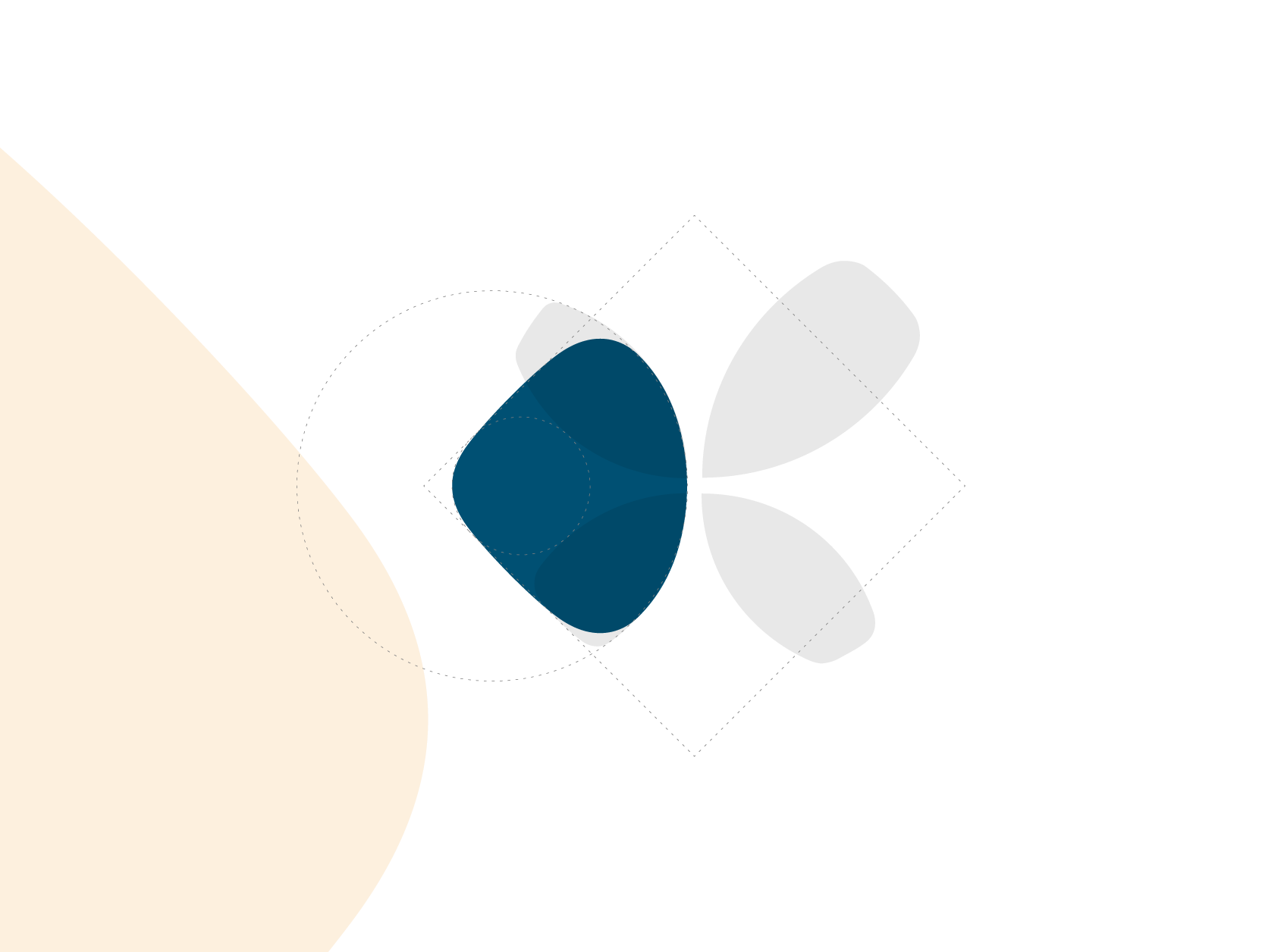
New brand element
An organic brand element brings much needed distinction and flexibility to Relex’s identity, and makes all visual material immediately memorable.
Approach
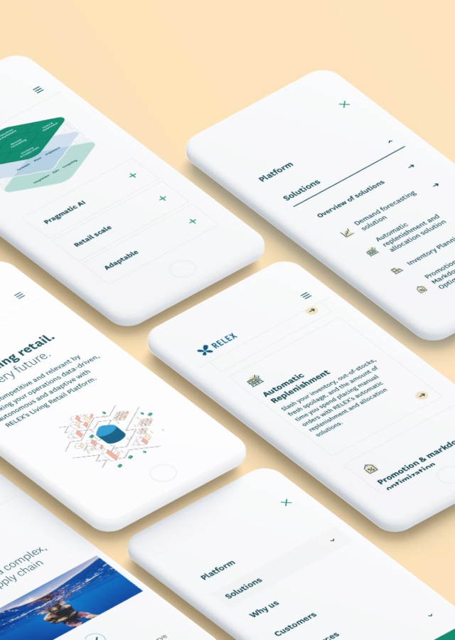
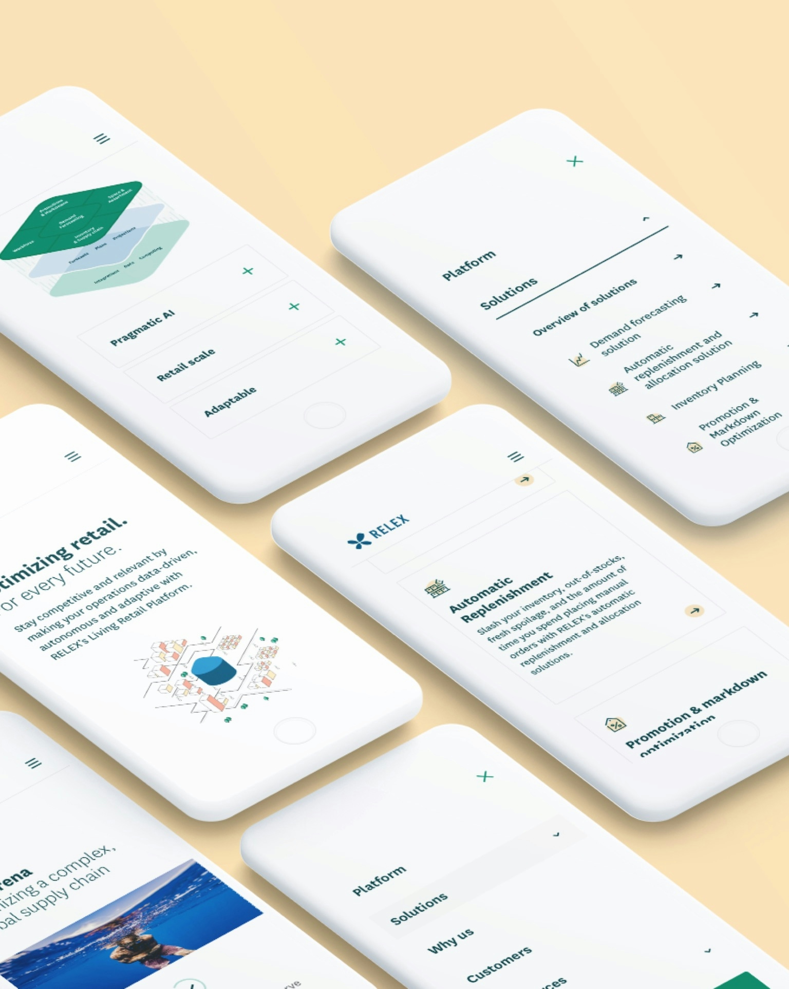
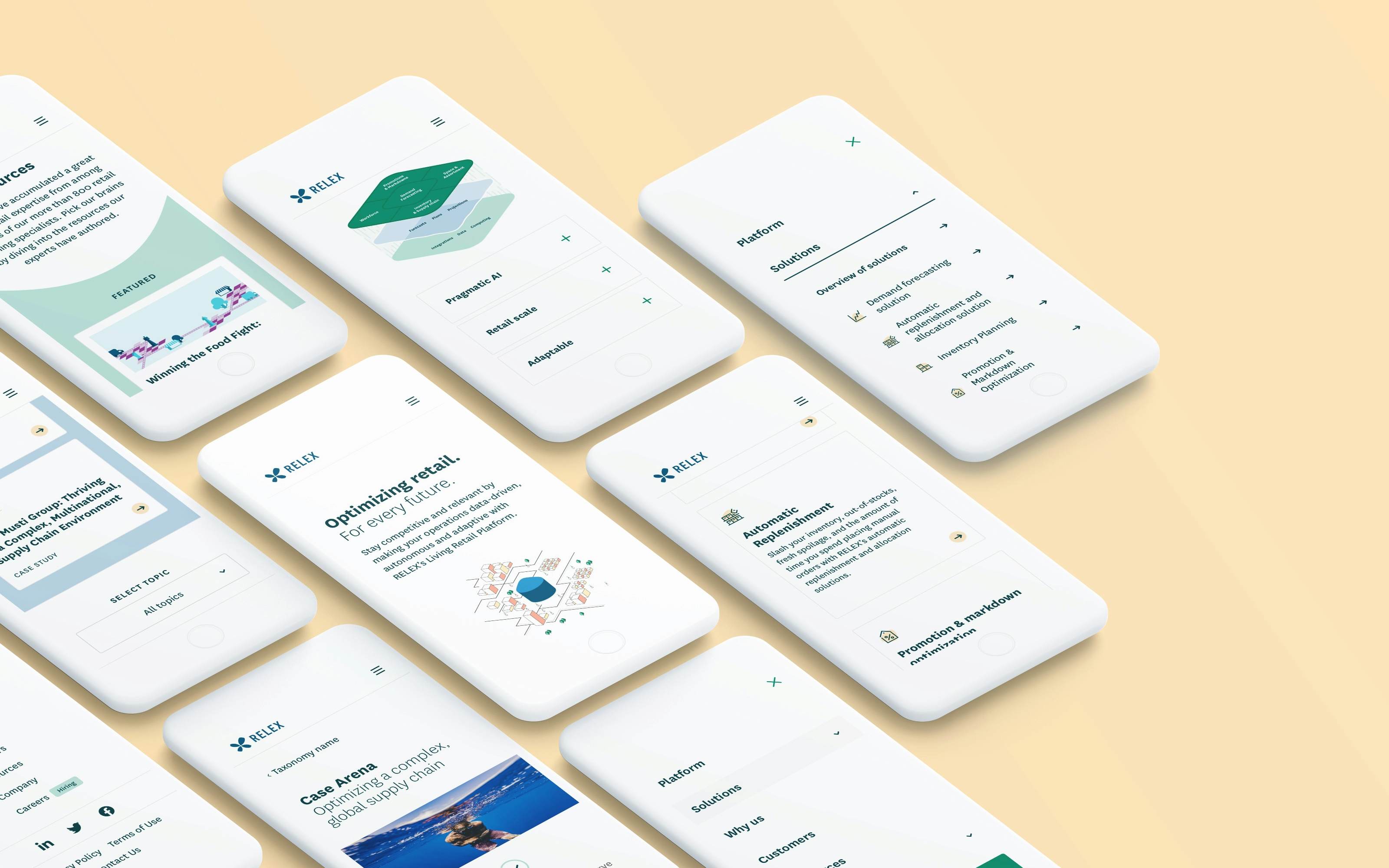
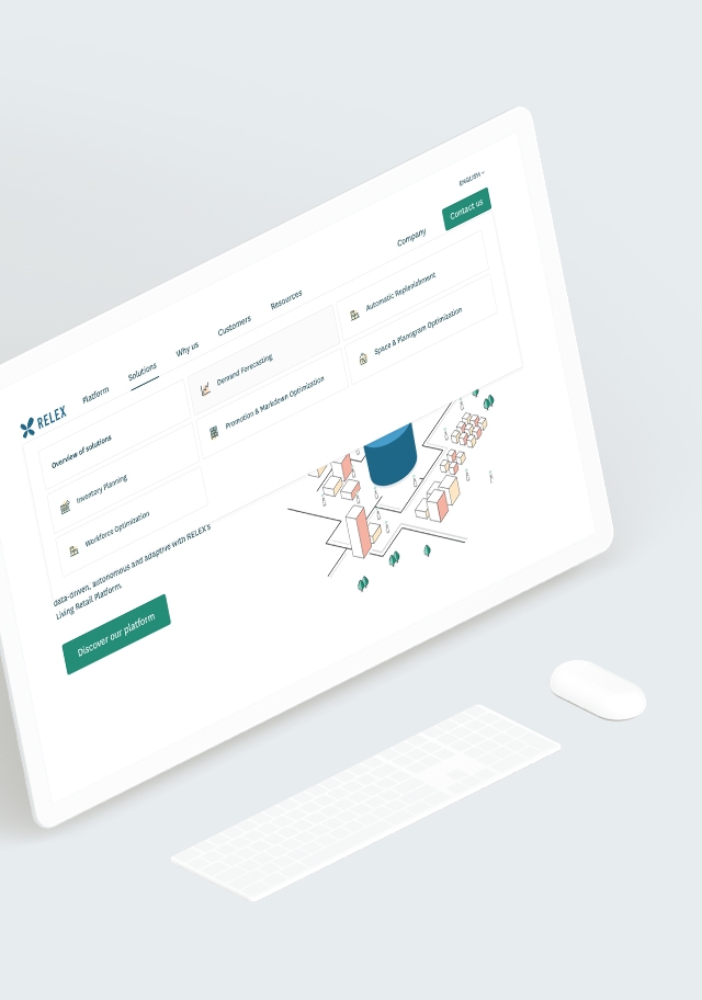
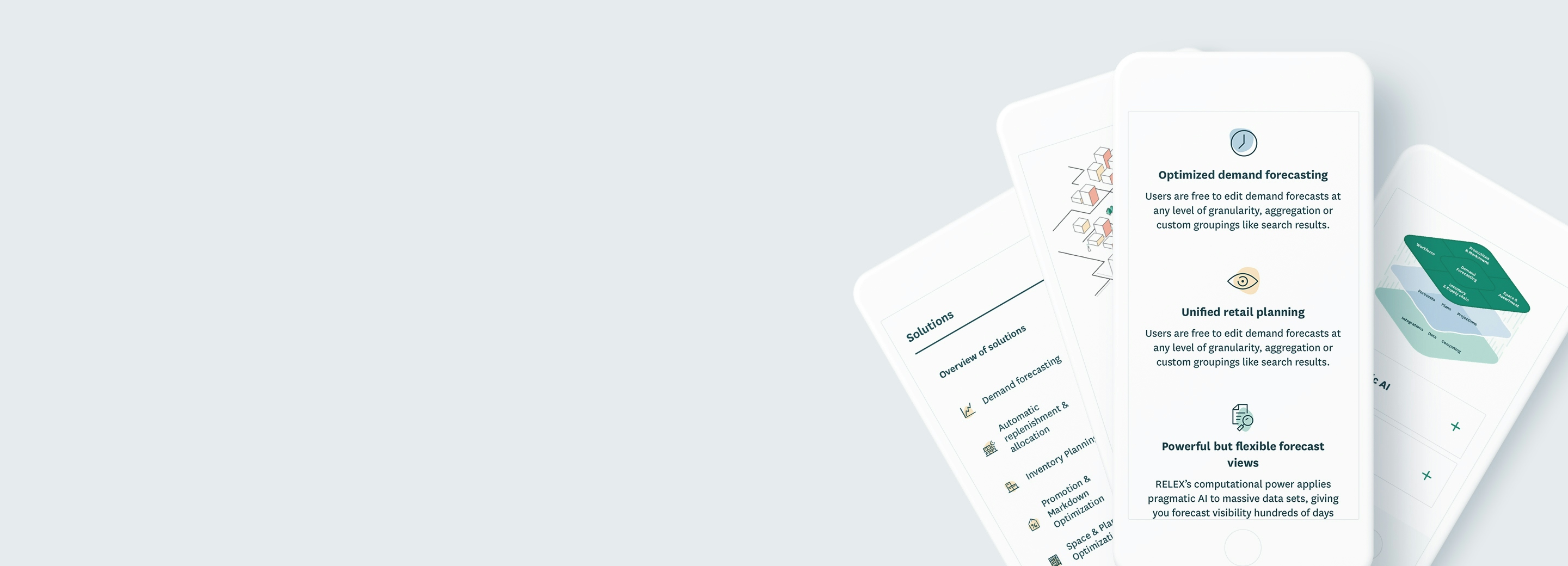
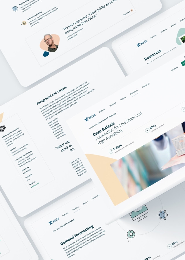
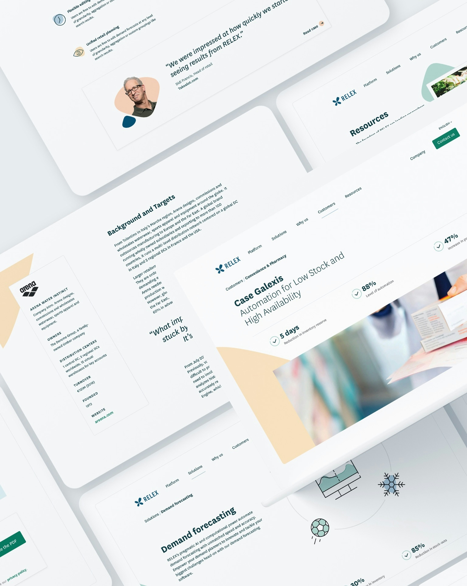
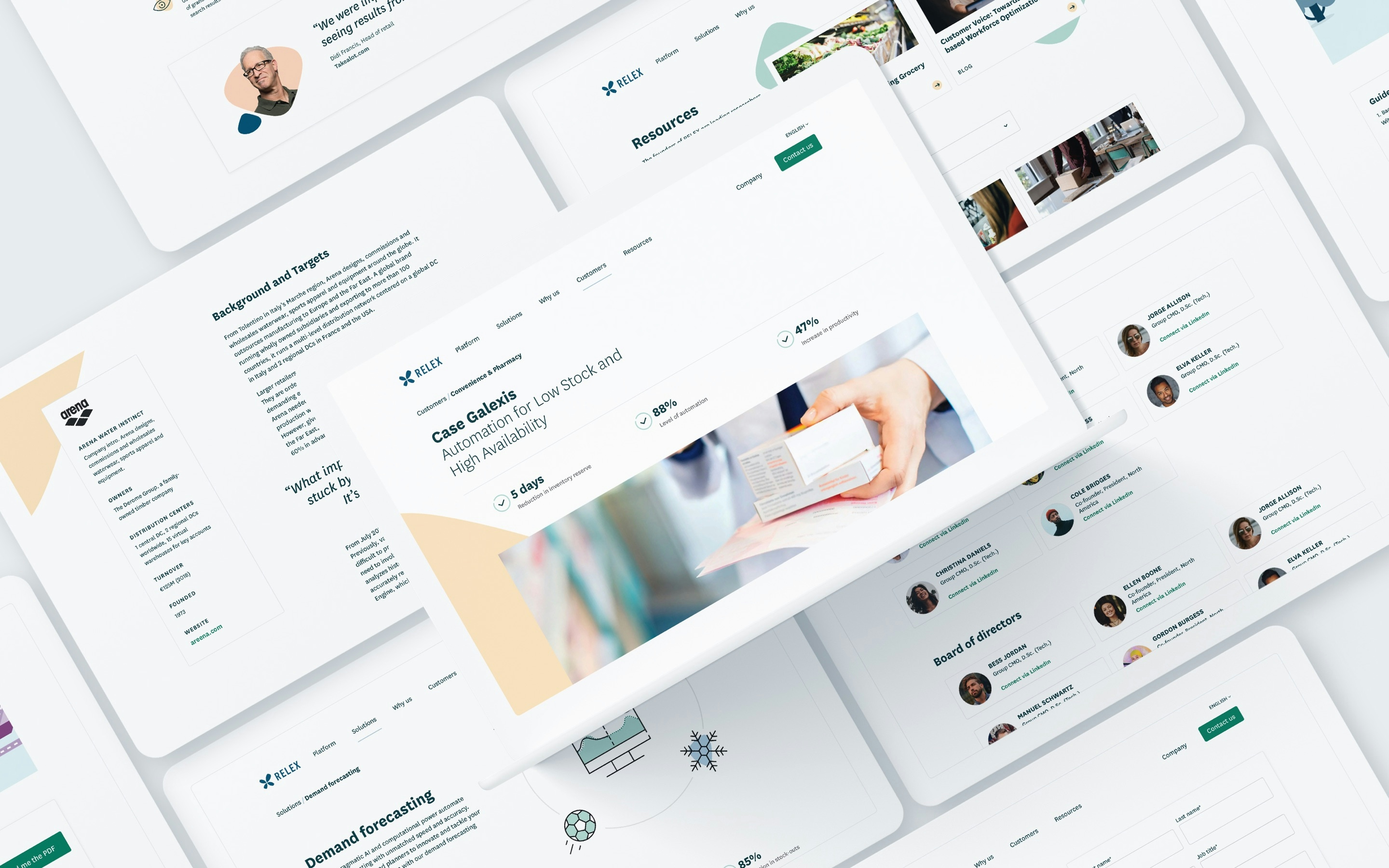
For the website renewal we redefined the goals of the site, the key users and essential features for the first launch. With this approach we were able to restructure the information architecture from the ground up and design optimal user flows for each kind of visitor, furthermore clarifying the website’s role in the sales process. We used an agile project approach and set up a clearly defined collaboration model which allowed us to develop the site in weekly sprints, and enabled the client to start the content input very early on.
Solution
Together with RELEX’s team we developed a renewed brand image that is fresh, genuine and future-proof. An organic brand element and unique color palette brings the much needed distinction and flexibility, and above all, makes all visual material immediately memorable. All of the visual updates were ultimately condensed into a set of extensive brand guidelines, featuring in-depth recommendations for imagery, tone of voice and color usage.
Our non-negotiable rule for this project was to keep things simple and robust, no matter what. Following this mantra, we delivered a modular and clear admin interface, a custom-made WordPress theme, built from scratch, and a user-friendly backend using WordPress’ Gutenberg editor.
In the end, we launched RELEX’s new site on schedule without cutting corners, providing the team with a flexible, technically future-proof and visually attractive website that better serves the needs of their international team.
We are extremely proud of the end result, but one thing is for sure: we could not have done this alone. We owe a huge thank you to our new friends at RELEX for the trust they put in us, and being an integral part to making this mammoth of a project such a success for everyone.