Good UX practices for all businesses
UX or User Experience plays a crucial role in building a solid rapport with the customer, that will last in time and evolve in a strong loyalty toward your product or service and ultimately your Brand.
11.7.2021
For all businesses, in today's time, the first contact between the user and the brand often happens on digital platforms - being that a website or an app. This first interaction is critical for both your Company and the user: the user will accomplish their goals in a smooth way and will want to come back again or the user will have a frustrating time moving through the interface and abandon the website/app for good.
UX or User Experience plays a crucial role in building a solid rapport with the customer, that will last in time and evolve in a strong loyalty towards your product or service and ultimately your Brand.
As a web company, having worked with a variety of businesses, we have realised that a lot of people ask how UX is going to benefit their business. This article thus tries to address this fundamental question for business owners and demonstrates how UX and Business growth go hand in hand.
UX Design is a discipline that includes research, planning, strategy, and problem solving. Specifically, designing for business requires first understanding the brand, its target audiences, their needs and then aligning these needs with the brand’s mission and goals.
At Contrast we master this process and we can help businesses grow. Here is how we operate, starting from research, the foundation for all things UX.
Understanding users and business goals
A lot of businesses feel that they know their users very well, but they are so involved in their product that they start believing that the users will be able to perceive it as easily as they do.
Research helps in defining who the users are, what their goals are and what they are trying to achieve through the product. User research can ultimately help a business take a more user-centric approach.
User research can involve a number of steps and documentation depending on the product, but these are the absolute essentials.
1. User Personas
Remember: we are designing for real people, with real needs! It is important to start the designing process by getting to know your audience and aligning to their goals and emotions.
The best tool to do so is to create a user persona, which is an archetypal representation of a larger audience for your product or service.
In order to create a persona, it is useful to look at your site’s analytics and other customer data while also conducting internal and external interviews and surveys. The overall discovering process will allow you to define behavioral patterns, goals, motivations, skills, attitudes of the user.
Lastly, keep in mind that your user personas can change over time as your business and target groups evolve. You might want to repeat the process over time!

Example of user personas documentation in The Practical Guide to Experience Design: https://practical.guide/experiencedesign/personas.html
2. User flow diagram
This tool helps you understand how users should move through your website or product. Start by deciding how you expect them to move through the site, then compare it to how they actually interact with it. There are analytical tools that allow you to see how users are engaging with your website in real time - one example for all is Google Analytics.
User personas will help you at this point - when you understand the profile of the user on your site, you can better plan the optimal path throughout your product.
Don't be scared to change your product in the face of this information: once you have learned how people use your product, make of user experience a top priority.

An example of user flow for managing expenses categories in a financial assistant web app. Source: https://dribbble.com/shots/7877934-Personal-Financial-Virtual-Assistant-User-Flow-Diagram/attachments/486694?mode=media
From ideation to implementation: Information Architecture
Often, weak navigation or cluttered web pages work against a positive experience of your product, making any goal´s accomplishment nearly impossible for the user. As we said, this can lead to frustration and result in losing customers and trust toward the Brand.
The next step in the design process aims to address these problems that often afflict digital products, but that can be overcomed with few useful UX tools. In this step you define a new and improved Information Architecture or IA.
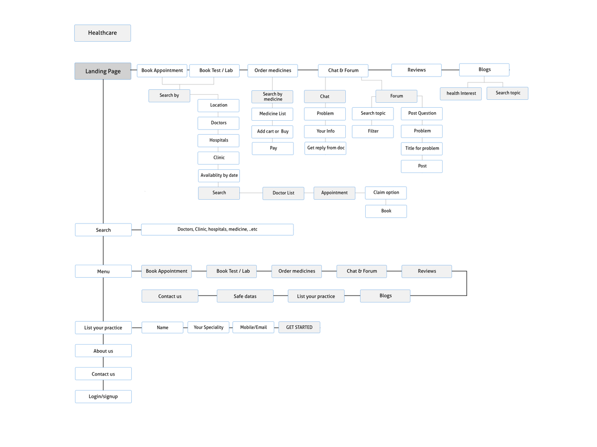
Information Architecture refers to the blueprint of the information and content in a product. A good AI for your website or app can make your product more efficient and consistent and it is beneficial for both the stakeholders as well as the user.
Once the AI is improved, it provides a hierarchy of information flows that can then be used to create the Sitemap for the project and then Wireframes.

An example of Information architecture scheme for a healthcare website. Source: https://dribbble.com/shots/5878515-Healthcare-Information-Architecture/attachments/5878515-Healthcare-Information-Architecture?mode=media
1. Sitemaps
Once you’ve studied the user flows and organized the information in a solid Information Architecture, start by building a sitemap for the pages you would like to create.
A sitemap shows the hierarchy of all the pages and subpages within your website or product, representing in fact an effective tool for achieving that efficiency that we have talked about.
Creating a sitemap makes it easier to imagine how a user will get from point A to point B on the website, and how many clicks it will take to do it, lifting that frustration of navigating a confusing structure from your user.

An example of sitemap for a traveling mobile app. Source: https://dribbble.com/shots/5972047/attachments/5972047-Wireflow-for-Traveling-App?mode=media
2. Wireframes
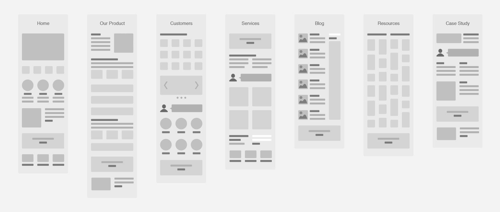
Everything you have discovered so far in the research phase translate into early-stage and low- fidelity prototypes: the wireframes. This tool provides a visual representation of the entire product´s structure and makes it possible for every stakeholder to see and interact easily with it. This is also helpful for a business because it is interpreting business goals into pages and it gives a clearer vision of what the product is going to look like, especially to non-designer stakeholders.

An example of low-fidelity wireframes. Source: https://www.gravitatedesign.com/blog/types-of-wireframes/
Finalising your product
User Interface design or UI is the next and final step of the user-centered-process we have described so far. A good UI design will give a consistent look throughout your product, making it easy to use and enjoyable, while defining the hierarchy of information for each section.
The best tool to finalise the product, is to create a high-fidelity prototype. This is the step where you define a grid, an accessible web typography, colours, images and CTA. (Read more about CTA design in our blog post “CTA design tips and guidelines”)
Prototyping is also the phase where your product will distinguish from the rest: colours, typography, images and interactions of the interface will help enhance the look and feel of the product and, at the same time, create a certain connection and trust with your Brand. Read more about brand in our past blog posts: “The role of brand identity in UI/UX design ” and “Creating a cohesive brand image through illustrations”
In conclusion: why is UX Essential for Business Growth?
UX design - and UI design as well - plays an important role in the business’ success because it enhances users’ satisfaction. This consequently helps building the Brand value and overall reputation and success of the business. Moreover, if the users have trusted your product to complete a certain goal - being that buying a pair of shoes or looking for specific information about how to use a screwdriver - it is our responsibility to provide them with the most efficient way.