Best Practices for eCommerce Product Filters
How do you create the best product filters for your customers? In this article, we will break down five crucial design aspects of well-functioning product filters, and list three things you can do right now to improve your product filters.
17.9.2022
Filtering products is a crucial part of any eCommerce website. Product filters help your customers narrow down large product offerings into smaller, manageable chunks – specifically tailored to their needs and interests. Without filters, finding the right products can become a daunting task, even for the most motivated customer. Simply put, if a customer can't find what they need, they can’t buy it.
So how do you create the best product filters for your customers? In this article, we will break down five crucial design aspects of well-functioning product filters, and list three things you can do right now to improve your product filters.
In a nutshell
Filtering and sorting help customers increase the relevance of the product offering, but do so in different ways.
Learn from your user’s behavior to determine which filters you offer and how.
Tailor your filters to your product offerings.
Make sure customers always know which filters they have applied.
Avoid having empty filtering results.
Terminology (Filtering vs. Sorting vs. Categories)
Before we get into the meat of the matter, here is a quick rundown on the difference between filtering, sorting and categories, as users might use the terms interchangeably:
Sorting: Sorting presents items in a specific order (e.g., newest first) or alphabetically. It does not, however, reduce the number of items shown. Sorting enables customers to compare products by the attributes they care most about.
Filtering: Filtering, on the other hand, reduces the number of items that are shown to the customer based on a specific criterion. A filter consists of two components – the filter category/type (e.g., color) and the filter value (e.g., white). Usually, filters can also be combined to further narrow down the product offering (e.g., Size: M & Color: white)
Product categories: Product categories describe the way products are generally organized within a (eCommerce) store. Product categories are usually hierarchical (e.g. Clothing > Women’s > Tops > Shirts), and mutually exclusive (e.g., Shirts vs. Pants). On an eCommerce site, sorting and filtering typically happens on a product category page.
A concrete example: The customer wants to buy a white shirt in size M. They navigate to the Shirts category page and then filter for all white shirts in size M. From a technical perspective, the product category is filtered using the value white for the type color, combined with the value M for the type size. The customer then sorts the remaining shirts by price to find the cheapest one available.
It has to be noted that there is another way of customizing the product offering on an eCommerce store: the site search. Customers often use site search when they’re trying to locate a very specific item (e.g., an Adidas Performance MARIMEKKO X ADIDAS shirt), rather than browse the full product range.
In the end, customers typically need both the ability to exclude non-relevant products (i.e. categories & filters) and to judge the range of products (i.e. sorting) for optimal control over the product offering.
How to design product filters
1. Make your filters understandable to your customers
Whether you’re serving products to a niche group of experts or a more general audience, your filters need to speak the same language as your customers. If customers can’t understand the filters, it can be as damaging as not having them in the first place. In the worst case, ambiguous language can lead users to abandon an eCommerce site altogether.
The simplest way to make filters more understandable is to avoid industry-specific filters and internal jargon. But rather than removing those kinds of filters altogether, try to use terms that the customer is more likely to use. If jargon is unavoidable, or of significant value to an expert user, try to provide visual examples or extra information that can clarify the filter terms for your customers.
Lastly, remember to use appropriate currency and measurement units when serving international audiences.

What is the difference between Canon cameras with “Built-in Wi-Fi” and “Wi-Fi”? Ambiguous filters can lead users to choose too wide or narrow selections, or to ignore the filters altogether.

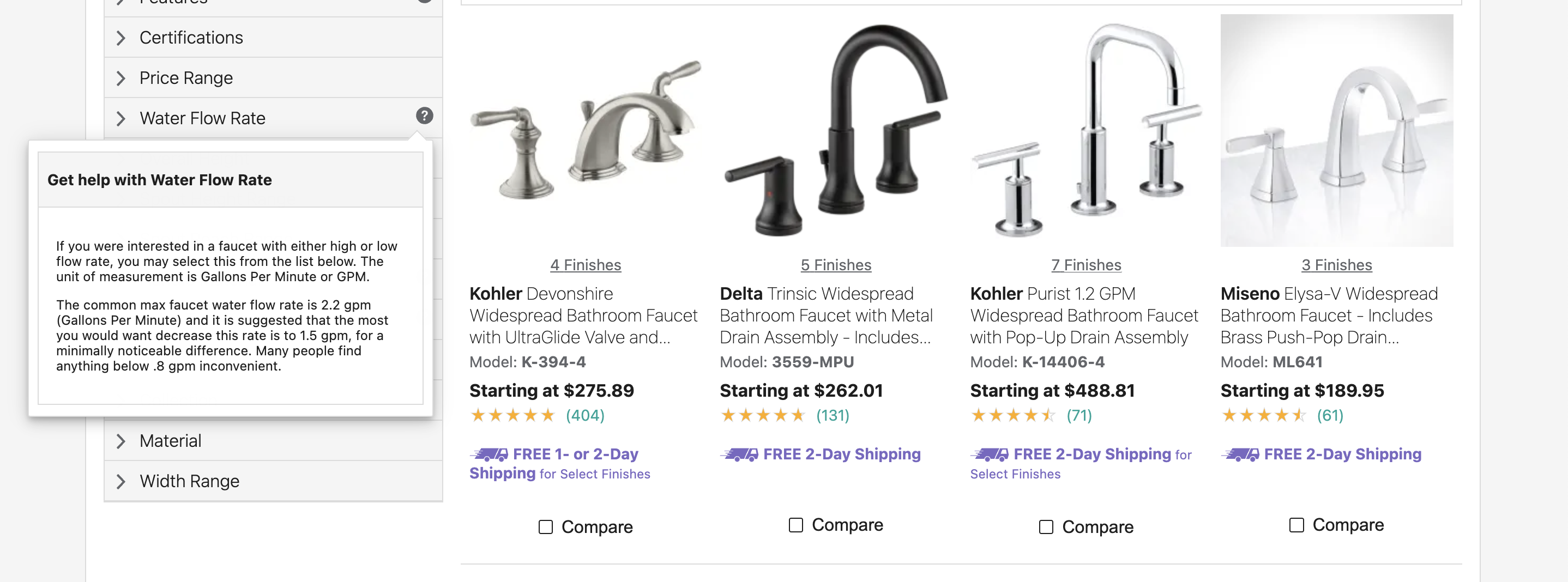
U.S. webstore build.com provides explanations of potentially unknown filter categories on demand, helping the users to better understand their options.
2. Make your filters product specific
While some “basic” filter categories should be available for almost all products (think Price, Color, Ratings), most products benefit from category- and product-specific filters. While customers might want to filter both motorboats and candles by price, having filters such as Capacity and Aroma greatly improves their ability to find the right product for their needs. Implementing thematic filters, such as Wedding or Winter, can also benefit customers, especially when they have no specific purchase in mind.
To decide which product attributes warrant their own filters, you should define characteristics that influence your customer’s buying decision the most. As a general rule, if a product attribute is important enough to be included in the product name or listing, you should consider having it as a filter.
Creating product-relevant filters can take a lot of time and effort, but it is one of the easiest ways a small, specialized store can provide a better customer experience than a large, generalized site.

Gigantti offers a range of product-specific filters for various product categories, e.g., type of plug and cable length. To further improve the experience, other cable attributes could be included, such as “fast”, which is already included in many of the product names.

Dermosil.fi offers filters specific to cosmetic products, such as compatibility with skin types. To further improve the experience, the site could also provide explanations on how to correctly identify the different types.
3. Order filters based on customer needs
As both screen space and the customers’ attention are limited, it is important to help customers find relevant filters as fast and easy as possible.
When filtering products, customers are looking for attributes connected to their purchase goals. Therefore, filters should be ordered logically and according to their relevance to the target audience. Filters that apply to a majority of users and products should be located at the top of the order, and become more specialized further down. This is true for both filter categories (e.g., Price, Color, Size) and filter values (e.g., Small, Medium, Large).
If there is no meaningful order for your values, the safest way to sort is from low to high or alphabetically. For some filter values, such as brands, it can make sense to use a combination, where favorite values are lifted the top, followed by an alphabetical list.

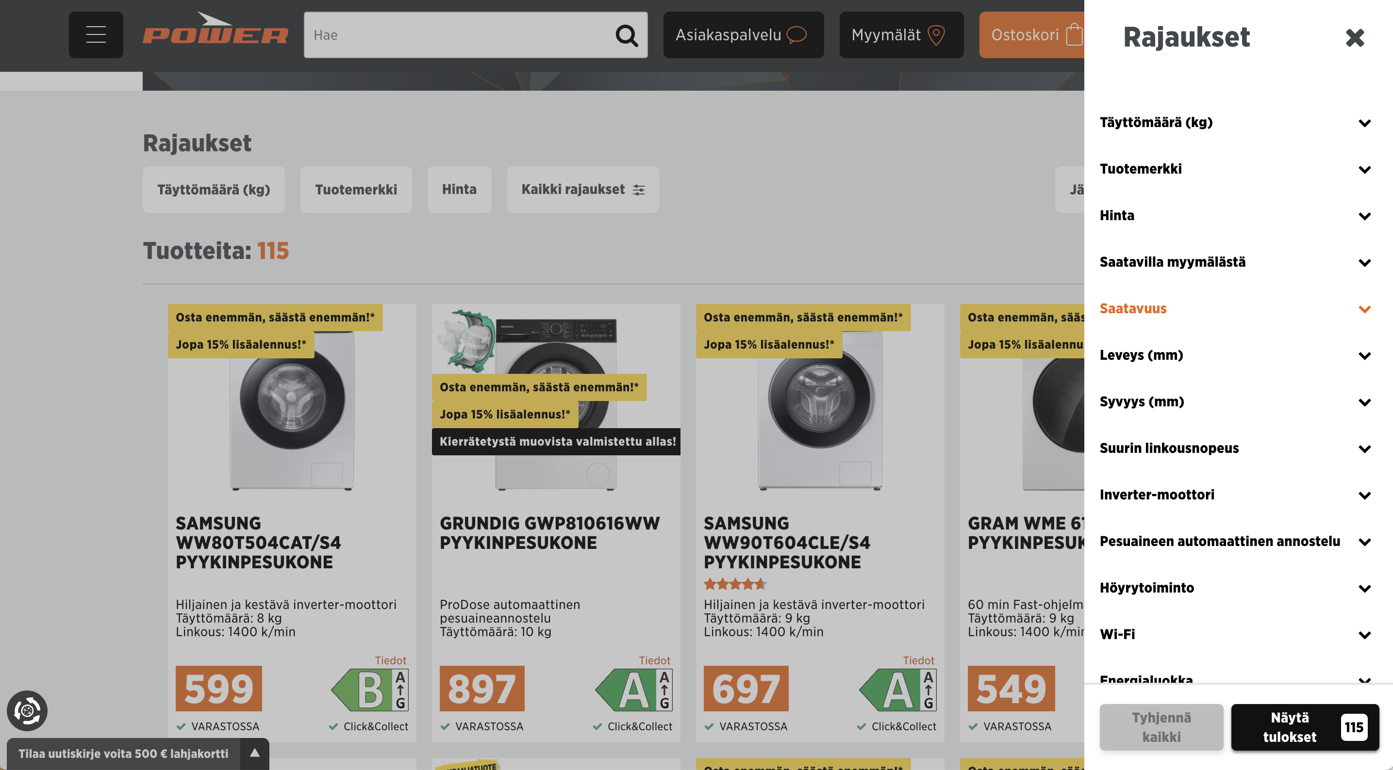
Power.fi sorts filter categories according to what users are most likely interested in when purchasing a washing machine. The capacity, brand, and price of a washing machine are arguably more important to most customers than specialized product attributes such as wifi.
4. Highlight the applied filters
Customers not only need to find and understand the available filters, they also need to have a clear understanding of which filters are currently applied. User research has shown that having no overview of applied filters can slow users down, as well as cause disorientation when browsing a site.
To avoid these issues, it’s recommended to visually lift out the applied filters, showing the name of the filter value. In some cases, adding the filter category can also be beneficial as it clarifies the filter’s context.
Visually separating the applied filters not only serves as a handy overview, but it also gives visual confirmation that a filter has indeed been applied. This is especially helpful on mobile, where users don’t always see the change in the product selection immediately (due to filters being implemented as overlays). Having all applied filters easily visible and accessible also gives users a quick way to refine or remove their selection without hunting down tick-boxes one by one.
Finally, users don’t always consciously choose applied filters. Whether they are redirected to a filtered product list or select filters by accident, if the applied filters aren’t shown to give context to the product selection, customers may misinterpret the offering, and abandon the site entirely.

K-Rauta displays a list of applied filters at the top of the product list. The site also provides easy options to remove one or all of the filters.
5. Avoid empty results
Any action a user willingly takes in an interface needs to have a rewarding outcome. When you have a lot of filters or a small amount of products, you quickly run the risk of filters yielding empty results when combined. This is especially frustrating when your customers spend a lot of time and energy modifying filters in order to find a product.
To avoid actions that yield empty results, the best practice is to automatically remove filters with no results. If that is not possible, e.g., due to technical reasons, a simple solution is to indicate the number of available products directly on the filter, sparing your customers the frustration of an empty page.


Yliopiston Apteeki automatically removes filter values that yield no results when another filter has been selected. Furthermore, the site also indicates the number of available products for each filter value.
What you can do right now
In order to address some of the areas discussed in this article (such as avoiding empty filter results), you will need the intervention of a designer and/or developer. However, there are a handful of things that you can do right now in order to create better filters for your eCommerce site:
Learn from your users’ behavior to determine filter categories, filter value ranges, and wording. Search queries can show you what characteristics your customers are searching for, and what exact words they use to describe those characteristics.
Check your site analytics to determine which filter categories are the most popular with your customers. This can help you determine a filter order.
Examine your product tags. For any filter to work, your products need to be correctly tagged and classified.
Are you developing a new webstore right now and want to implement your filters right? Or do you have an existing webstore and want to know what you could do better? Contact us – we are happy to support your next eCommerce project.
Further reading:
https://www.nngroup.com/reports/ecommerce-ux-search-including-faceted-search/
https://thierrymeier.medium.com/filtering-and-sorting-best-practices-on-mobile-61626449cec
https://baymard.com/blog/horizontal-filtering-sorting-design
https://baymard.com/blog/allow-applying-of-multiple-filter-values
https://baymard.com/blog/5-essential-filters
https://baymard.com/blog/have-filters-for-list-item-info