6 guidelines for accessible website design
Accessibility refers to the concept of whether a product or service can be used by everyone - especially by people with disabilities, but not exclusively!
23.8.2021


Accessibility refers to the concept of whether a product or service can be used by everyone - especially by people with disabilities, but not exclusively!
We have already talked about accessibility in one of our blog posts, outlining how it is not only a designer’s moral duty to design accessible products, but also beneficial to both users and the brand.
Our job at Contrast is to make things easy for people to use, in any situation. That's why we take care of inclusivity throughout the entire design process. We want as many people to use our product as possible, right?
We have worked with clients who requested their websites to meet the Web Content Accessibility Standards. These projects have been a perfect opportunity to sharpen our knowledge on accessibility matters, both from the design prospective as well as development and quality testing.
Now, we’d like to share with you some simple steps we take to make sites more accessible.

Art by Cordelia Dillon
Accessibility myths we need to stop believing
There are a few myths about designing for accessibility I would like to dispel before we dig into the guidelines.
Accessibility vs Usability. “Accessible” is not the same as “usable”, even though both concepts overlap and are vital parts of UX design. Usability refers to whether a design is efficient and intuitive to use. Theoretically, this means that usability includes accessibility, since a product that is inaccessible is also unusable to someone; In practice, however, usability tends not to specifically focus on the user experience of people with disabilities - be they permanent or temporary disabilities. Accessibility, on the other hand, is concerned with whether all users are able to experience an interface.
Accessible design helps only people with disabilities. No, accessible design helps everyone! Designing for Accessibility is not only the right thing to do, it also brings value for all users, not just those with disabilities. For instance, video captions that help people with hearing difficulties are also useful to a person who is watching the video on mute. Legible, high-contrast text not only helps people with poor vision, it can also benefit people using their device outdoors in bright sunlight.
Designing for accessibility is difficult. No, making a website accessible is not difficult. When you design a product from scratch and decide to meet the accessibility requirements early on the project, there shouldn’t be additional effort.
Designing for accessibility
There is a strong business case for accessibility: studies show that accessible websites have better search results, reach a bigger audience, are SEO friendly, have faster download times, encourage good coding practices, and always have better usability.
The following 6 guidelines for accessible website design are easy to implement and can help your products get closer to meet the level AA of the Web Content Accessibility Guidelines (WCAG 2.0).
1. Support keyboard navigation
Keyboard accessibility is one of the most critical aspects of web accessibility. Most people with disabilities – but also a high percentage of general users – use the tab key to navigate through interactive elements on a web page: links, buttons, or input fields.
For keyboard navigation to work, the order of interactive elements is essential: left to right, top to bottom.
Another tip: try to be concise with your interactive elements. This includes both the number of links and the length of the link text. Tabbing through long menus may be demanding for people with motor disabilities, and listening to lengthy links can be frustrating for people who use screen readers.
Source: W3C Keyboard
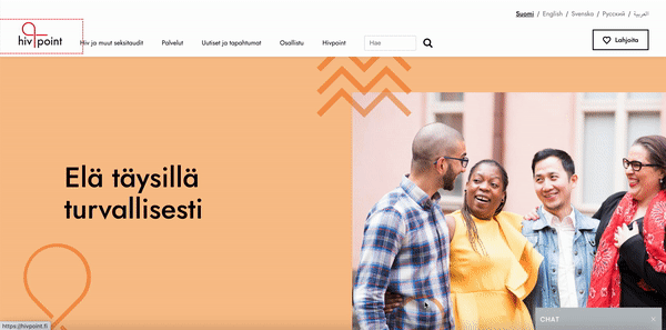
Our recent website for Hivpoint supports keyboard navigation
2. Provide (accessible) visual clues for keyboard focus
Have you noticed the outlines that sometimes show up around links, inputs, and buttons? These outlines are called focus indicators. Focus indicators help people to see which element currently has the keyboard focus, supporting them to find their place when navigating your site. The elements that should be focusable are links, form fields, widgets, buttons, and menu items. (Source: https://opensenselabs.com/blog/articles/accessibility-ux-design)
Note: Browsers, by default, use a CSS pseudo class to show blue-colored outlines on elements when they’re selected. You might find these default focus indicators not very pretty, but don’t hide them! You can design focus indicators that fit the style of your site and go well with your brand. Also, remember to create an indicator that with good contrast, so it stands out from the rest of the content.
Source: W3C Focus Visible
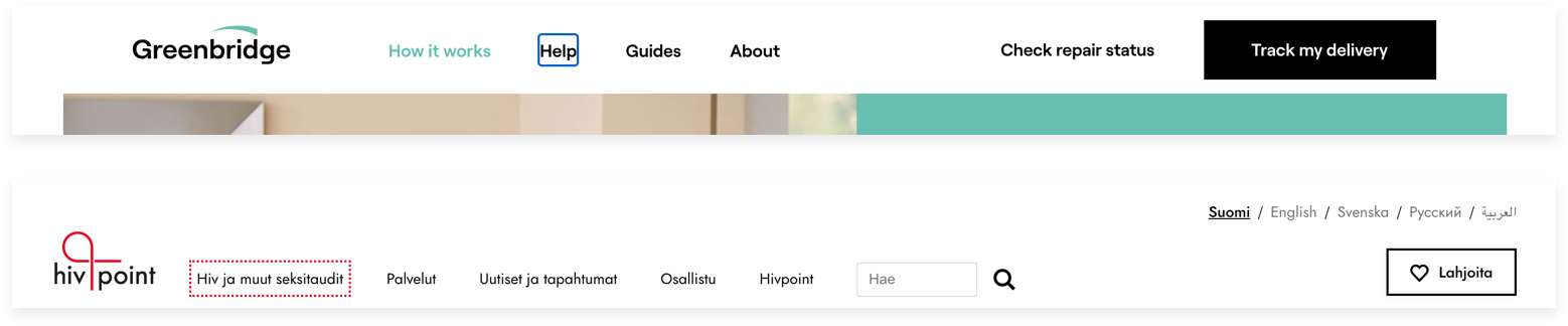
Above an example of a visual indicator resembling the CSS pseudo class blue-colored outline. (source Greenbridge) Below, the keyboard focus indicator that we have restyled to match Hivpoint’s visual style.
3. Add enough colour contrast
The World Health Organization (WHO) estimates that there are 217 million people who have moderate to severe vision impairment. So it is critical to provide a sufficient contrast between text and backgrounds.
According to the W3C, the contrast ratio between text and background should be at least 4.5 to 1 (conformance level AA.) If your type has a size of at least 18 pt regular or 14 pt bold, the minimum contrast ratio drops to 3 to 1.
There are tools that help you check contrast quickly: for example the WebAIM color contrast checker will calculate the score for both regular and larger text sizes, specifying the WCAG level (A, AA, AAA.) Changing the color values, you can adjust the outcome to match AA or AAA level.
Source: WCAG Visual Contrast
4. Don’t use only color to make critical information understandable
A green field for success, a red field for error – oftentimes interfaces rely solely on color coding to show the user some critical information, such as input errors, status changes, or labels. Using colors as the only visual cue, however, means that people with visual impairments will have a hard time understanding your content.
This can be easily remedied: for example, when showing errors on screen, don’t rely on colored text alone, add an icon, a pattern or a label. Red-green blindness is the most common form of color-blindness and affects up to 8% of males and 0.5% of females of Northern European descent. For links, consider adding a visual cue such as font weight or underline text style to make them stand out.
With more complex information like charts and graphs, use other visual aspects to communicate information like shape, labels, and size.
Source: WCAG Visual Contrast Without Color
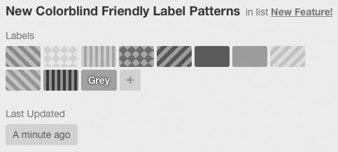
Trello has included new colorblind friendly labels for monochromatic vision
5. Be careful with forms
There are two things to be careful about when designing accessible forms: field boundaries and field labels. To make a form as accessible as possible, make sure that your input fields are rectangles with clearly defined boundaries and that every field has a visible label. It’s as easy as that!
Using placeholder text as labels is one of the biggest mistakes when designing a form. Firstly, placeholder text is usually gray and has a low contrast, so it’s hard to read. It's also common to see placeholders that disappear once one starts writing, which makes it hard for the user to know what the fields are about once the label is gone.

In this example (Facebook registration page) only placeholders are used and no labels at all. As soon as the user starts typing they can’t see the field label anymore and the contrast between the text and the white field is not high enough.
Another reason lies in the backend functionalities of forms. People who use screen readers usually navigate through a form using the tab key to jump through the fields. The <label> elements are read for each form control. Any non-label text, for example placeholder text, is usually skipped over.
Source: WebAIM Creating Accessible Forms

An example of an accessible form input field from one of Contrast’s designs. Note that the error message does not rely on red only, but also on the icon.
6. Write alternative text for images and other non-text content
As already mentioned, people with low vision often make use of screen readers that convert text to speech to read out the content of a website. This works fine with text content, but what happens when there is a picture or other non-text content, such as a video? To make it possible for screen readers to “read” an image, we can use the <alt> attribute of a picture to describe its content.
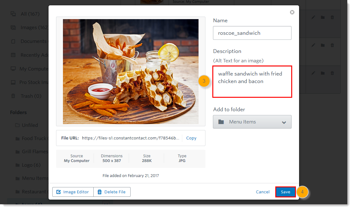
An example of an <alt> attribute that describes the content of a picture. This content is read by the screen reader (source)
On the other hand, if an image is purely decorative, then adding an empty <alt> attribute will make screen readers skip it. But remember! If you don’t write any <alt> text, some screen readers will instead read out the file name of the image. That’s the worst and most undemocratic experience you can provide.
Source: W3C Using Alt Attributes
Conclusions
At Contrast we practice what we preach and we want to continue the conversation on the importance of accessibility.
Recently, we have helped Hivpoint build their new website compliant with level AA of the Web Content Accessibility Guidelines, and we are working with other clients to meet the same requirements for their websites.
And while there are many rules and guidelines surrounding accessibility, we believe that designing for accessibility has actually broadened our creative output: we can now bring our high visual standard to an even wider set of users.